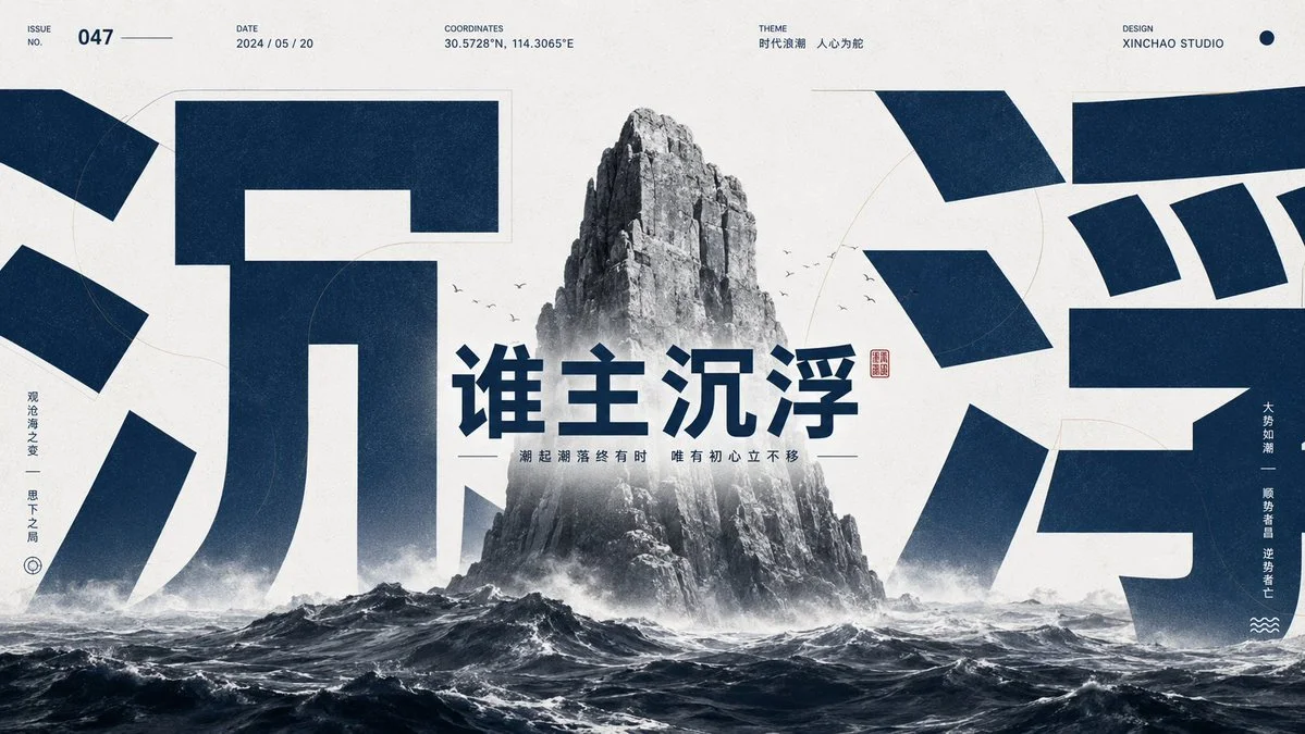
Generate a visual work with a strong graphic-editorial feel around any subject object: translate the theme into a clear main form or symbolic carrier, placed in front of and behind giant cropped glyphs, numbers, or abstract marks, with the glyphs carrying the image's main visual weight and cut off at the edges like an architectural structure, revealing only partial strokes and inner negative space, creating an immense sense of scale and text-image pressure at first glance; the main subject appears in grayscale, low saturation, or monochrome image texture, with crisp edges but slight grain, partially occluding the glyphs and inversely surrounded by them, creating layers where the foreground entity and background symbol nest into each other. Keep the background clean, bright, and airy with high luminosity; add thin semi-transparent outlines, soft shadows, and slight paper noise to give a retro-print tactility without muddiness. Extract colors from the theme's own material, emotion, and semantics: a large base color carries the bright structural field, the giant glyphs use a highly saturated theme-derived emotional color as the main accent, the subject image uses crisp light-and-dark grays to establish real weight, and the small info texts at top and edges use the same accent color or its dark variant; keep little strong color, a large light base, clear light-dark steps, and clean boundaries; the mood should be calm, precise, bright, and powerful. Typography uses a restrained modern sans-serif system, with a short info group at the top, small size, tight tracking, and clear alignment, like archive labels, reinforcing order without stealing the first read from the giant glyph-and-subject overlap. Overall avoid an ordinary illustration feel; the theme, giant glyphs, negative space, info labels, and grainy texture must together form an image-text fusion work with a designer's touch.

Cover text: 谁主沉浮
Color scheme: matching the theme of this text
Centered composition
Ratio: 16:9
Use: self-media dazibao cover